
The American Psycho business card scene is one of the most referenced moments in professional culture. Not because of the film’s darker themes. But because it captured something painfully real about how professionals judge each other in competitive environments.
Most people watched American Psycho and remembered the violence.
Professionals remembered the business cards.
That says something important about how deeply that scene cut into the reality of competitive professional life. A film full of disturbing imagery, and the moment that haunts people in boardrooms and networking events is four minutes of men comparing paper stock around a conference table.
Why does that scene still hit so hard?
Because it’s true.
What Actually Happens in the American Psycho Business Card Scene
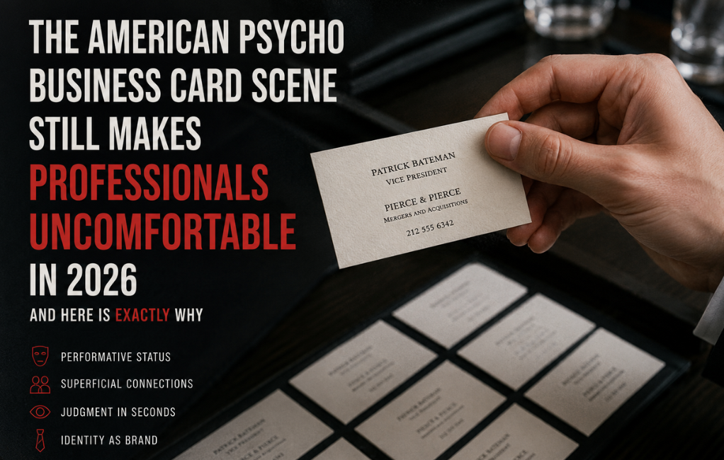
Patrick Bateman presents his business card with visible pride.
Cream colored. Raised lettering. Tasteful thickness.
Then his colleagues pull out their cards. Slightly better font. Slightly better paper. A watermark he didn’t think to include.
Nobody says anything cruel. Nobody laughs. The humiliation is entirely internal.
Bateman’s confidence collapses in real time over something most people would consider completely trivial.
That’s exactly what makes the scene so uncomfortable to watch. Because most professionals have felt a version of that moment. Maybe not about a business card. But about something small that suddenly felt enormous in a competitive environment.
Why the American Psycho Business Card Became a Cultural Symbol
The scene works because it captures something that professional life rarely admits out loud.
Small details carry disproportionate weight in first impressions.
Before someone reads your credentials, hears your pitch, or sees your work, they’ve already formed an opinion based on visual cues. Your appearance. Your posture. The quality of materials you carry.
The American Psycho business card became shorthand for that entire dynamic.
When professionals talk about obsessing over card design, paper weight, or typography, someone always references that scene. Not because they’re being dramatic. Because it perfectly illustrates the silent judgment that happens in professional environments every single day.
According to Forbes, first impressions in professional settings form within seconds and physical details like business cards play a measurable role in how credibility gets established before a single word is spoken.
For a broader look at how professional presentation tools work together to create a complete first impression, this overview of business professional attire explains how every visible detail contributes to the story someone builds about you before the conversation even begins.
The Real Lesson Behind Bateman’s Reaction
Here’s what the American Psycho business card scene is actually about.
It’s not about business cards.
It’s about the anxiety of comparison in competitive environments.
Bateman believed his card represented the peak of professional sophistication. The moment he saw something slightly better, his entire self-assessment shifted. His identity was so tied to external markers of success that a minor difference in paper quality produced genuine psychological distress.
That’s satire. But it’s sharp satire because the underlying feeling is real.
Most professionals have experienced a version of it. Seeing a competitor’s website that looks sharper than yours. Walking into a meeting underdressed. Handing over a card that looks thin next to someone else’s.
The details trigger the comparison. The comparison triggers the doubt.
What the American Psycho Business Card Teaches About Professional Presentation
The lesson isn’t that you need expensive cards.
The lesson is that presentation communicates before you do.
Every physical detail a person encounters before they know you creates a story about who you are. Your card. Your holder. Your handshake. The condition of the materials you carry. These things speak before your mouth opens.
In the American Psycho business card scene, nobody evaluates Bateman’s actual skills, intelligence, or professional capabilities. They look at his card. And that’s enough to establish a hierarchy.
That dynamic didn’t disappear when the film came out in 2000. It’s still operating in every client meeting, every conference, every professional introduction happening right now.
Why Business Cards Still Matter When Everything Is Digital
People assumed LinkedIn would kill the business card.
It didn’t.
Digital connection is convenient but it’s forgettable. A LinkedIn request gets accepted and disappears into a feed of hundreds of other connections. A physical card sits on a desk. Gets picked up again. Creates a second moment of contact that digital simply doesn’t replicate.
The American Psycho business card scene resonates partly because it captures something digital networking cannot replace. The physical exchange creates a real moment between two people. The quality of that moment is influenced by every tangible detail involved.
A card handed over with intention, from a clean holder, in good condition, communicates something that a phone tap never quite matches.
Research from Harvard Business Review confirms that physical interactions in professional networking create stronger and more memorable impressions than digital alternatives, particularly in high-stakes first meetings where trust needs to establish quickly.
For a broader look at how physical and digital professional tools work together, this piece on business casual women touches on how intentional professional presentation creates consistent impressions across every element of how you show up.
The Design Elements That Actually Separate Good Cards From Forgettable Ones
The American Psycho business card obsession was about subtle differences.
Not dramatic ones.
That’s worth understanding because most people think good card design means expensive or elaborate. It doesn’t.
Paper weight matters more than most people realize. A card that feels substantial communicates quality through touch alone. Thin cards feel disposable because they are disposable.
Typography communicates personality instantly. Clean fonts read as confident and clear. Overly decorative fonts read as trying too hard. The font choice tells people something about how you think before they read a single word.
White space is not wasted space. Cards crammed with information feel desperate. Cards with breathing room feel established. Confidence doesn’t need to fill every millimeter.
Color should serve the brand not compete with it. Subtle intentional color choices communicate sophistication. Complicated color schemes communicate noise.
What Bateman Got Right and What He Got Wrong
Bateman understood that details matter.
That part was correct.
Where the character went wrong was tying his entire sense of professional identity to external validation markers. The American Psycho business card wasn’t a tool for connection. It was a scoreboard.
That’s the trap the scene is satirizing.
A great business card creates a moment of positive impression that supports a relationship. A card obsessed over purely as a status symbol misses the point entirely. The goal is not to win a comparison. The goal is to be remembered well by someone worth remembering you.
How to Apply the American Psycho Business Card Lesson Without the Anxiety
Take the lesson without taking the neurosis.
Care about your card quality without building your professional identity around it. Use good paper. Keep the design clean. Present it from a proper holder rather than a crumpled pocket stack.
Then move on.
The card opens the door. Your actual value keeps it open.
Bateman’s mistake wasn’t caring about presentation. His mistake was believing presentation was everything. The professionals who get this balance right treat their card as one well-executed detail among many rather than the whole performance.
FAQ
Why is the American Psycho business card scene so famous?
It captures the anxiety of professional comparison in a way that feels exaggerated but uncomfortably accurate. Most professionals recognize the feeling of being measured by small details in competitive environments.
What does the American Psycho business card scene say about card design?
It shows that subtle quality differences register immediately in professional settings. Paper weight, typography, and design choices communicate status and attention to detail before any conversation happens.
Are business cards still relevant today?
Yes. Physical cards create tangible memorable moments that digital networking cannot fully replicate. A well-designed card presented intentionally still carries real professional weight in 2026.
What is the actual lesson from the American Psycho business card scene?
Presentation matters but it should serve connection not comparison. Care about the details without tying your professional identity to them.
Conclusion
The American Psycho business card scene endures because it captured something professionals feel but rarely say directly.
Small things matter. Presentation communicates before you do. And the anxiety of comparison in competitive environments is real regardless of how irrational it seems from the outside.
The takeaway isn’t to obsess over paper stock like Patrick Bateman.
The takeaway is simpler.
Take your professional presentation seriously enough that the details work for you rather than against you. Good card. Clean holder. Intentional presentation.
Then let your actual work do the rest.
That’s the version of the lesson that serves a career.
The Bateman version just leads to a very different kind of ending.